Spectrum and Timeline tabs
The Spectrum and Timeline tabs have much in common, and take two different approaches to a common goal: Displaying received packets sequentially in time.
In the Timeline tab the packets are grouped vertically by their sender device.
In the Spectrum tab, the packets are plotted according to frequency and time. In addition, the blue background colouring represents the power detected in the spectrum at that time and frequency.
In both tabs, time gaps to earlier/later packets and events are shown. More detail is shown in the Spectrum tab than in the Timeline, but the gaps displayed in the Timeline (if "Show Gaps" is enabled) will always represent gaps between events from the same Device/Connection.
Time deltas are drawn from packet start to packet start; when space allows, the gap between the end of a packet and the following start is also shown.
Spectrum
Timeline
Common Interface
Spectrum
Timeline
Filtering
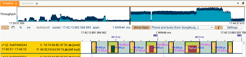
In both the Spectrum and Timeline tabs, the filtering applied corresponds to the filtering in the currently active (last clicked-on) Summary tab, combined with a device filter of your choice, or no device filtering. So to see all packets in the Spectrum or Timeline, clear all filtering in the active Summary tab, and select No Device Filtering in the dropdown in the Spectrum/Timeline. In addition, in the Timeline you have the option to display or hide decoded audio for any suitable audio streams which are shown.
Mouse control
The mouse can be used in one of four modes: Pointer, Pan, Zoom and Measure. These can be selected using the buttons in the top left of the tab. The Pan, Zoom, and Measure modes can also be enabled temporarily by holding down Shift, Control or Alt respectively.
In all modes other than Zoom mode, the mouse scroll-wheel can be used to:
a) scroll vertically in the Timeline view, when the mouse is over the labels at the left-hand side.
b) scroll horizontally in the rest of the Timeline view and in the Spectrum view.
Details of the four modes:
-
In Pan mode, the display can be dragged left and right.
-
In Zoom mode:
-
The scroll wheel zooms in and out. There are two modes for zooming, to match conflicting customer requests; zooming in and out will either zoom to the mouse pointer, or zoom while leaving the centre of the time window fixed. Choose which mode you want using the context menu in the Timeline/Spectrum.
-
A region can be selected by clicking and dragging, to zoom to that time region.
-
-
In Pointer mode, clicking in the Spectrum/Timeline display will select the packet/event closest to the pointer (including selecting it in the Summary and Details tabs).
-
In Measure mode, pairs of packets can have cursors added to them; the time difference between cursors is shown, and cursors can be removed or jumped to using the context menu.
In the Spectrum tab, when an event is selected, time gaps to the previous/next event of the same time will be displayed if the zoom level allows. If no time gaps appear, try zooming in! A selected event will also be selected in the Timeline and Summary tabs, unless you have used the filtering controls to hide it in those tabs.
Keyboard control
The arrow keys can also be used to navigate; Up and Down zoom in and out, Left and Right jump earlier and later.
In the Spectrum tab, the A and Z keys increase and decrease the intensity of the Spectrum Power plot. The colourbar at the left-hand side of the tab shows how the bluescale corresponds to power in dBm.
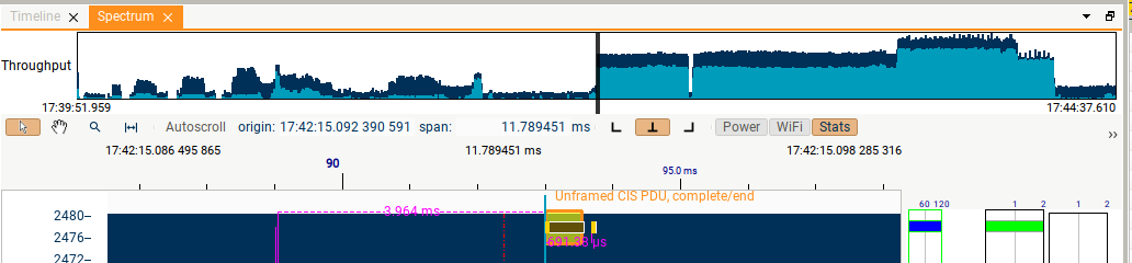
Throughput plot
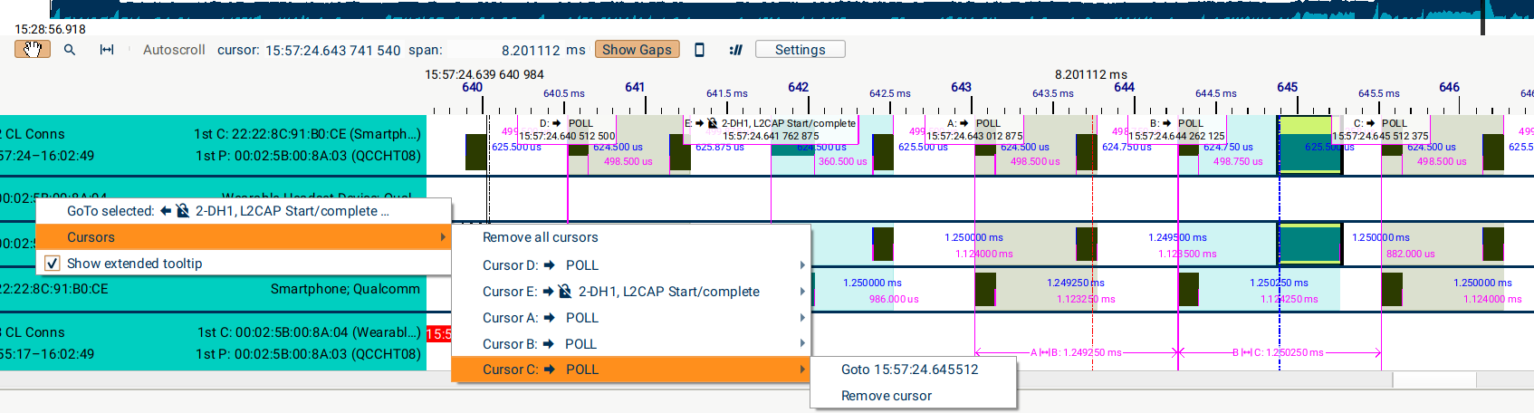
The throughput plot at the top of each tab shows the whole capture, and illustrates two estimates of Bluetooth traffic rate; one (darker blue) including all packet types, and one excluding Advertising packet and empty packets (LE Empty, NULL/POLLs etc). The black window shows the current time-range shown in the main Spectrum/Timeline area, and this window can be dragged (select the middle of the window) or extended/shrunk (select the arrows which appear to the left and right of the window when you hover).
Settings
Right-click in the rows of the Timeline, or anywhere in the Spectrum to see the context menu. There are several options to control how the GUI behaves:
-
"Zoom to pointer" controls the behaviour of the scroll-wheel when zooming, as described above.
-
Measurement cursors: as you move your mouse, these can either snap to a packet edge only when close to a packet, or always snap to a packet/other event (e.g. logic line edges).
These, and other settings, are also available in the "Preferences" dialog.
Spectrum
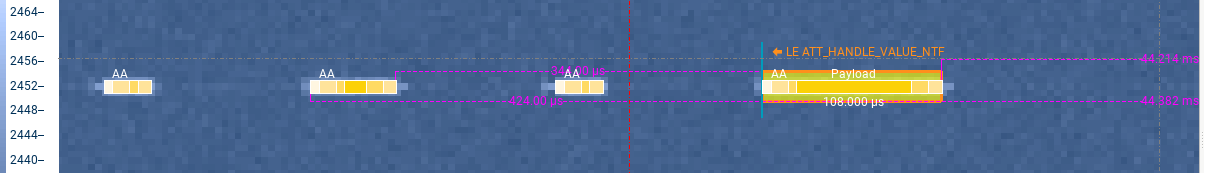
In addition to the Power plotted in bluescale, the text in the top-right of the tab displays the power that was measured at the time and frequency corresponding to the pointer position. This text also records the attenuation used by the Moreph's amplifier during capture; an unexpectedly large attenuation value could indicate interference.
Two important notes:
-
The power displayed in a time interval represents the peak power measured during that interval. This can look slightly confusing when using low-resolution spectrum capture, as a packet can appear as a short blob in the middle of a long grey rectangle.
-
The lengths of the rectangles representing the packet header and other packet segments are:
a. accurate at high zoom
b. pictorial at low zoom; the rectangles are wider than the actual time interval in order to prevent them becoming invisibly narrow.
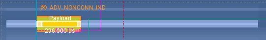
A 376 µs packet marooned in a 2 ms peak-hold window.
Statistics display
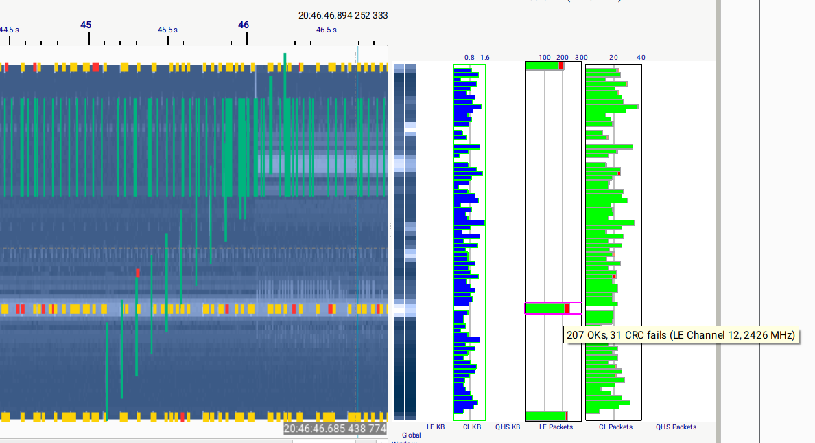
Per-channel statistics showing average power, throughput, and packet success (rates of ReTXes, CRC or dewhitening fails, and Rejections) can be enabled using the "Stats" button. To see details of the values represented by each bar in the bar chart, hover over the bar.
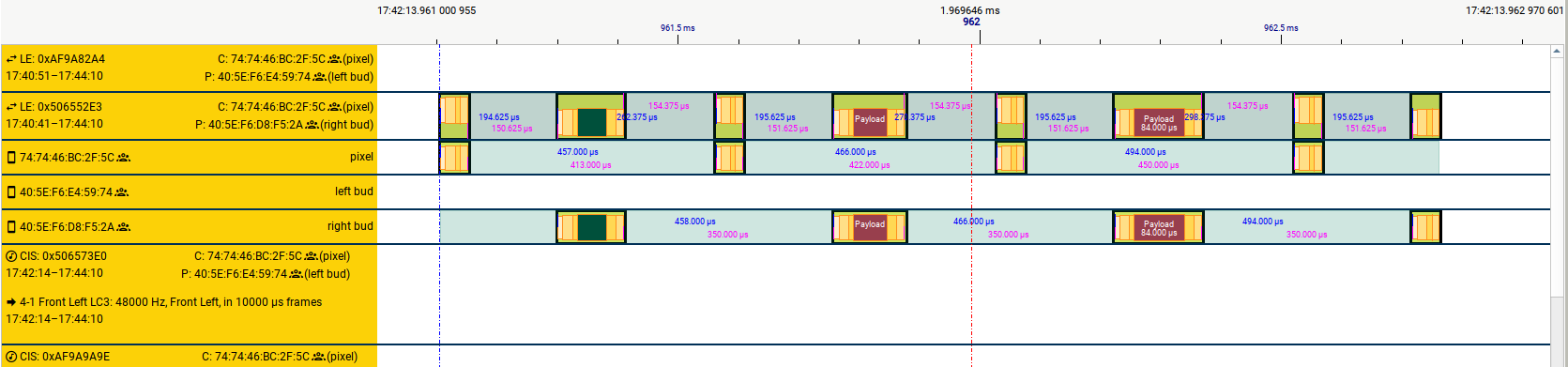
Timeline
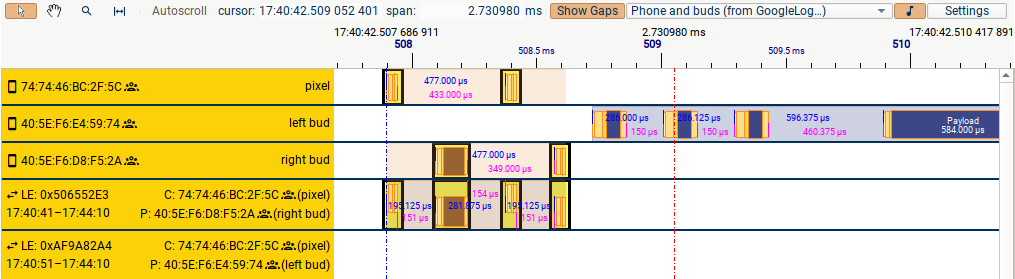
The shorter rectangles in solid colours represent on-air packets. The larger translucent rectangles represent groupings of those packets (LE Advertising Events and Connection Events, BR/EDR Slot Pairs, CIS/BIS events). The selected packet or packets are highlighted with a yellow box; as in the Spectrum tab, clicking on a packet will cause it to be selected in the other tabs unless it has been hidden there.
The rows shown in the Timeline are determined by the devices, connections, and audio streams you have enabled in the chosen device filter. If you find that the packets from your DUTs are separated out into too many rows and it's hard to see everything you need, there are two ways to reduce the number of rows:
-
Use the "Connections" mode in the device filter and deselect some of the connections or audio streams. This is helpful when your DUT has various connections to uninteresting 3rd devices and you are only interested in e.g. the phone <-> earbud connections.
-
Use the "Connection Sessions" mode (selected in the Timeline "Settings" dialog). This collapses all connections between a particular pair of devices onto one row, so is particularly helpful if your DUTs are repeatedly disconnecting and reconnecting.
You can control the order the rows are displayed in using the "Settings"
popup: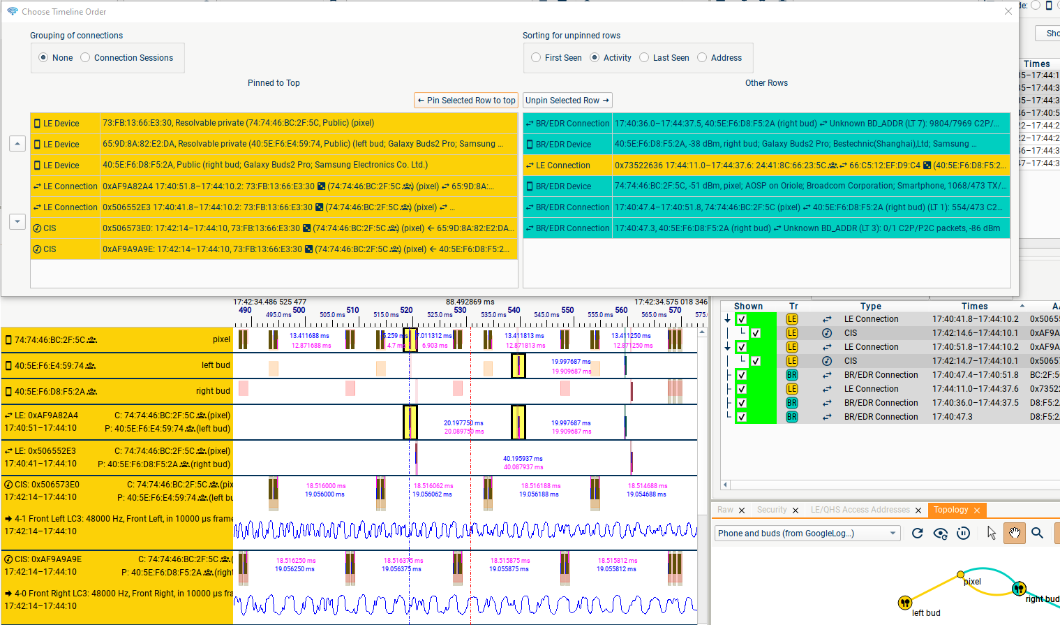
You can "pin" the rows you're interested in by moving them into the left-hand column (double-click on an item to move it left or right), and choose the order of the pinned rows; these will be displayed at the top of the Timeline view. All other rows, including rows created when new devices/connections are seen, will appear below these, sorted according to your choice from "First Seen", "Activity" (e.g. number of packets), "Last Seen", or "Address".